Introduction to Dimensionality Reduction
Dimensionality reduction techniques aim to decrease the number of variables (dimensions) in a dataset, improve data visualization, lower computational complexity, and mitigate the curse of dimensionality.
Why Reduce Dimensions?
Ideally, a dataset should contain as many observations as possible (e.g., the number of patients observed or studied). A large number of observations offers significant advantages: it provides more information, enables better generalization of machine learning models, improves result stability (reducing sensitivity to extreme values), enhances pattern recognition, and decreases statistical variability. However, increasing the number of observations can be costly and challenging, particularly in fields like medicine.
The dimension of a dataset refers to the number of variables it contains. Unlike observations, a high number of variables (or features) in a dataset isn’t always beneficial.
The presence of high-dimensional data poses several challenges:
As dimensions increase, data becomes more dispersed, leading to higher variance and lower model accuracy—a phenomenon known as the “Curse of Dimensionality.”
High-dimensional datasets often contain “noise”—non-informative and redundant data that don’t provide useful information but can mislead the model.
Reducing dimensions significantly improves computational performance.
Our ability to visualize data is limited to 2-3 dimensions; higher dimensionality restricts our visualization capabilities.
When dealing with high-dimensional datasets, it’s essential to employ reduction techniques. These dimensionality reduction methods play a vital role in Machine Learning, particularly when analyzing complex data such as images or intricate medical information.
Types of Dimensionality Reduction Methods
Dimensionality reduction techniques for datasets can be categorized into linear and non-linear approaches.
Linear techniques
Linear techniques focus on identifying directions of maximum data variance. They aim to reduce dimensions while preserving as much variance—and thus informational content—as possible. Principal Component Analysis (PCA) and Linear Component Analysis (LCA) are examples of linear techniques.
Non linear techniques
The core concept of non-linear techniques is based on Manifold theory, which proposes that high-dimensional data often lies on a simpler, lower-dimensional structure (manifold). Think of it like this:
Imagine a piece of paper (2D) that’s crumpled into a ball (3D). While it exists in 3D space, the paper itself is still inherently 2D.
Non-linear techniques like t-SNE (T-distributed Stochastic Neighbor Embedding) and UMAP (Uniform Manifold Approximation and Projection) work by trying to “unfold” this complex data while preserving important relationships between data points.
Unlike linear methods, these techniques can capture more complex patterns and relationships in the data, making them particularly useful for complicated datasets.
The key advantage is that these methods maintain the relationships between similar data points during the dimensionality reduction process, helping to preserve important patterns in the data.
Dimensionality reduction: PCA
Principal Component Analysis (PCA) transforms correlated variables into a new set of uncorrelated variables called “principal components.”
This method finds a representation of the data where the maximum amount of variance is captured using fewer dimensions.
Before performing PCA, you must normalize the data to ensure all values are on the same scale:
![]()
where μ represents the mean of each feature and σ represents the standard deviation.
Next, we calculate the covariance matrix to measure the relationships between variables:
![]()
Next, we calculate the eigenvalues (Σi), representing the variance proportion of the principal components, and the eigenvectors (vi), indicating the main directions of data variation.
By solving
![]()
We obtain the principal components and select the first k components corresponding to the largest eigenvalues:
![]()
Implementing PCA in Python
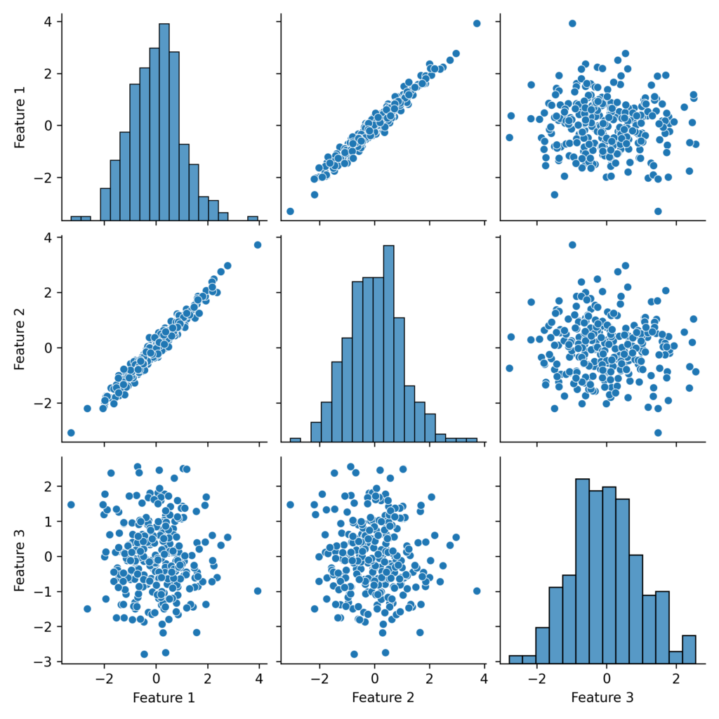
Let’s create a sample database with 3 features and standardize it:
import numpy as np
import pandas as pd
import matplotlib.pyplot as plt
import seaborn as sns
from sklearn.decomposition import PCA
from sklearn.preprocessing import StandardScaler

# Generating a synthetic dataset with correlated features
np.random.seed(42)
n_samples = 300
x1 = np.random.normal(size=n_samples)
x2 = 2.5 * x1 + np.random.normal(size=n_samples) * 0.5  # Correlated with x1
x3 = np.random.normal(size=n_samples)

X = np.column_stack((x1, x2, x3))
df = pd.DataFrame(X, columns=['Feature 1', 'Feature 2', 'Feature 3'])

# Standardize the dataset
scaler = StandardScaler()
X_scaled = scaler.fit_transform(X)

# Scatter plot of original features
sns.pairplot(pd.DataFrame(X_scaled, columns=['Feature 1', 'Feature 2', 'Feature 3']))
plt.show()

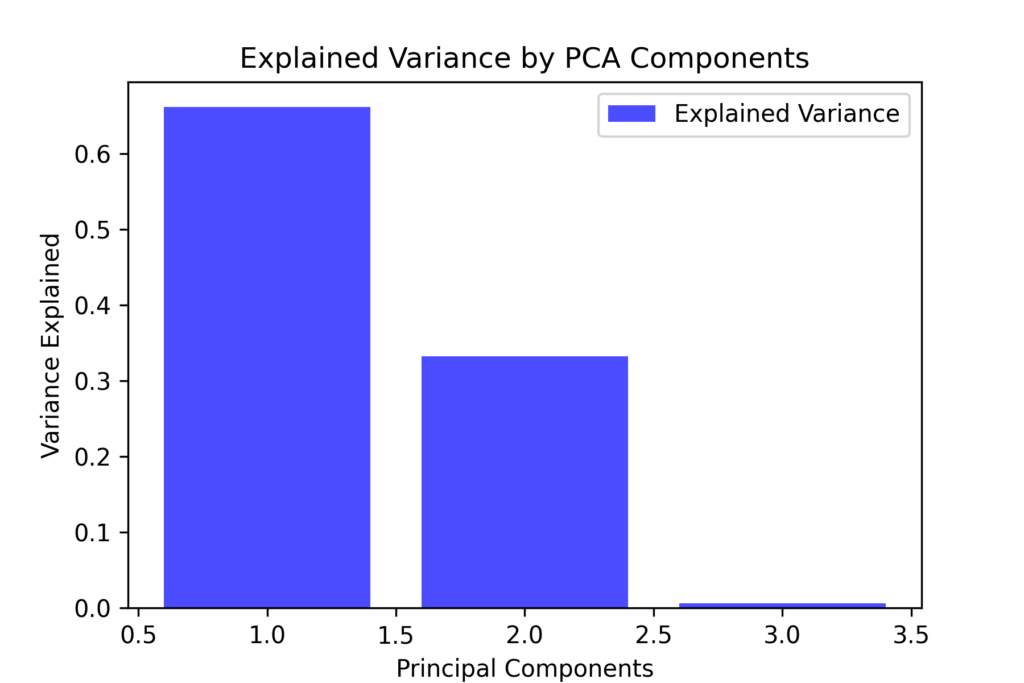
Let’s apply PCA and examine the explained variance:
# Applying PCA
pca = PCA(n_components=3)
X_pca = pca.fit_transform(X_scaled)

# Variance explained by each component
explained_variance = pca.explained_variance_ratio_

# Bar plot of explained variance
plt.figure(figsize=(6,4))
plt.bar(range(1, 4), explained_variance, alpha=0.7, color='b', label='Explained Variance')
plt.ylabel('Variance Explained')
plt.xlabel('Principal Components')
plt.title('Explained Variance by PCA Components')
plt.legend()
plt.show()

The graph shows that the first component accounts for most of the variance, while the second and third components contribute less significantly.
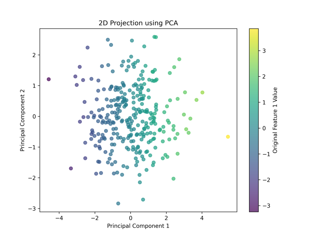
Let’s reduce the dataset to two dimensions and visualize its distribution
# Reduce to 2D for visualization
pca_2d = PCA(n_components=2)
X_pca_2d = pca_2d.fit_transform(X_scaled)

# Scatter plot of the first two PCA components
plt.figure(figsize=(8,6))
plt.scatter(X_pca_2d[:, 0], X_pca_2d[:, 1], c=x1, cmap='viridis', alpha=0.7)
plt.xlabel('Principal Component 1')
plt.ylabel('Principal Component 2')
plt.title('2D Projection using PCA')
plt.colorbar(label="Original Feature 1 Value")
plt.show()

It’s important to note that the new features are fundamentally different from the original ones. These transformed features don’t directly correspond to physical variables. For instance, if we started with two strongly correlated variables like “cholesterol” and “creatininemia,” PCA might create a single new feature that combines aspects of both.
As a consequence, this technique makes individual features more difficult to interpret meaningfully.
PCA Benefits and Limitations
PCA allows us to reduce redundant features and noise, improve the computational efficiency of machine learning models, and simplify data visualization by converting complex data into two- or three-dimensional relationships.
However, PCA has several limitations: it only performs linear transformations and cannot capture non-linear relationships, may lose important information from features that have low variance, and requires data scaling and normalization as preprocessing steps.
Dimensionality Reduction: t-Distributed Stochastic Neighbor Embedding (t-SNE)
t-SNE uses probability distributions to reduce the dimensionality of data by transforming distances between points into proximity probabilities.
To illustrate this concept, imagine our variables describe different animals: t-SNE groups similar cases together, clustering animals that share characteristics (like all felines in one group and all fish in another).
For any two points Xi and Xj we calculate the conditional probability of Xj being close to Xi using a Gaussian distribution:

Next, we calculate a new probability using a Student distribution to model the proximity of points in two-dimensional space, represented as qj∣i.
![]()
Since the probabilities in real space (pj∣ipj∣i) and two-dimensional space (qj∣iqj∣i) typically differ, t-SNE aims to minimize this difference using the Kullback-Leibler (KL) divergence.
![]()
Implementing t-SNE in Python
First, we’ll generate data with distinct clusters.
import numpy as np
import pandas as pd
import matplotlib.pyplot as plt
import seaborn as sns
from sklearn.datasets import make_blobs
from sklearn.manifold import TSNE
from sklearn.preprocessing import StandardScaler

# Creating a synthetic dataset with separable clusters
X, y = make_blobs(n_samples=500, centers=4, n_features=10, random_state=42)

# Standardization of data to make features comparable
scaler = StandardScaler()
X_scaled = scaler.fit_transform(X)

# Scatter plot of the first two features (original space)
plt.figure(figsize=(8,6))
plt.scatter(X_scaled[:, 0], X_scaled[:, 1], c=y, cmap='viridis', alpha=0.7)
plt.title("Original Data (First Two Features)")
plt.xlabel("Feature 1")
plt.ylabel("Feature 2")
plt.colorbar(label="Cluster")
plt.show()
Now let’s apply t-SNE to reduce the dimensions to two:
# Applying t-SNE with perplexity optimization
tsne = TSNE(n_components=2, perplexity=40, random_state=42)
X_tsne = tsne.fit_transform(X_scaled)

# Visualizing the results
plt.figure(figsize=(8,6))
plt.scatter(X_tsne[:, 0], X_tsne[:, 1], c=y, cmap='viridis', alpha=0.7)
plt.title("Dimensionality Reduction with t-SNE")
plt.xlabel("t-SNE Component 1")
plt.ylabel("t-SNE Component 2")
plt.colorbar(label="Cluster")
plt.show()
t-SNE Benefits and Limitations
t-SNE is a powerful and sophisticated tool specifically designed for exploring high-dimensional data, particularly excelling at revealing hidden patterns and clusters that might not be immediately apparent through other methods. Its advanced algorithms are particularly adept at capturing and representing complex non-linear relationships between variables, making it especially valuable for data visualization and pattern discovery in complex datasets.
However, its computational intensity and resource requirements can make it challenging to implement effectively with large datasets containing numerous observations. The algorithm’s complexity grows quadratically with the number of data points, which means processing time and memory usage increase substantially as the dataset size expands, potentially making it impractical for very large-scale applications.
Dimensionality Reduction: Uniform Manifold Approximation and Projection (UMAP)
UMAP is a dimensionality reduction method that outperforms t-SNE while preserving both global and local data structures.
Two key parameters control UMAP’s behavior: n_neighbors defines the number of nearby points to consider, and min_dis determines the minimum distance between points.
UMAP works by first creating a graph that maps relationships between neighboring points in the original high-dimensional space, then transforming this into a more compact two- or three-dimensional representation.
The neighbor graph is built using a probability function:
![]()
Then UMAP reconstructs a lower-dimensional space by minimizing the difference between the neighbor graphs in both high-dimensional and low-dimensional spaces.
![]()
Implementing UMAP in Python
Let’s create a dataset with distinct clusters:
import numpy as np
import pandas as pd
import matplotlib.pyplot as plt
import seaborn as sns
from sklearn.datasets import make_blobs
from sklearn.preprocessing import StandardScaler
import umap

# Creating a synthetic dataset with separable clusters
X, y = make_blobs(n_samples=500, centers=4, n_features=10, random_state=42)

# Standardization of data to make features comparable
scaler = StandardScaler()
X_scaled = scaler.fit_transform(X)

# Scatter plot of the first two features (original space)
plt.figure(figsize=(8,6))
plt.scatter(X_scaled[:, 0], X_scaled[:, 1], c=y, cmap='viridis', alpha=0.7)
plt.title("Original Data (First Two Features)")
plt.xlabel("Feature 1")
plt.ylabel("Feature 2")
plt.colorbar(label="Cluster")
plt.show()
Then we reduce the dimensions to two using UMAP:
# Apply UMAP with neighbor optimization
umap_reducer = umap.UMAP(n_components=2, n_neighbors=15, min_dist=0.1, random_state=42)
X_umap = umap_reducer.fit_transform(X_scaled)

# Visualize the results
plt.figure(figsize=(8,6))
plt.scatter(X_umap[:, 0], X_umap[:, 1], c=y, cmap='viridis', alpha=0.7)
plt.title("Dimensionality Reduction with UMAP")
plt.xlabel("UMAP Component 1")
plt.ylabel("UMAP Component 2")
plt.colorbar(label="Cluster")
plt.show()
UMAP Benefits and Limitations
UMAP offers greater efficiency compared to t-SNE while preserving both local and global data structures. It can effectively process large datasets.
However, since it is non-deterministic, results may vary between runs. Additionally, its performance depends heavily on finding optimal values for the n_neighbors and min_dist parameters.
Comparison between PCA, t-SNE and UMAP
| Method | Reduction Type | Local Structure | Global Structure | Speed |
|---|---|---|---|---|
| PCA | Linear | No | Yes | High |
| t-SNE | Non-Linear | Yes | No | Slow |
| UMAP | Non-Linear | Yes | Yes | Fast |
Further Readings
Dimensionality reduction – Wikipedia
Conclusions
Dimensionality reduction serves several crucial purposes: it improves computational efficiency, enables better data visualization, helps prevent overfitting, and reduces redundant data and noise.
Both linear and non-linear dimensionality reduction methods are powerful tools that require careful consideration. The optimal method depends on four key factors: data type, analysis goals, interpretability requirements, and computational constraints.


