← Continued from previous page
Analyzing Output and Results: -2 Log-Likelihood and Omnibus test
Logistic regression analysis typically follows a stepwise approach. Here’s a more detailed explanation of the process:
Starting Point: Baseline Model
We begin with a simple model that includes only the constant term. This serves as our starting point for comparison.
Variable Inclusion Methods
There are several ways to add variables to the model:
- ‘Enter’ method: All variables are added at once.
- Stepwise methods: Variables are added or removed one at a time based on statistical criteria.
Model Evaluation: -2 Log-Likelihood (-2LL) Test
At each step, we calculate the -2LL test. This measures how well the model’s predictions match the observed data. A decrease in -2LL indicates improved model fit.
Omnibus Test
This test compares the -2LL of the initial model to that of the final model. It helps us determine if adding variables has significantly improved the model’s predictive power. A p-value less than 0.05 suggests meaningful improvement.
Iterative Process
We continue this process of adding variables and evaluating the model until we find the right balance between model complexity and accuracy. This approach allows us to carefully examine each variable’s impact and build a robust predictive model.
Classification Table
IIn addition to the Omnibus test (which assesses the model’s fit with independent variables compared to a null model), another crucial evaluation relates to the accuracy of the model’s predictions.
The classification table displays the following for the model:
- True positive cases: Instances correctly identified as class 1 by both the dataset and the model
- True negative cases: Instances correctly identified as class 0 by both the dataset and the model
- False positive cases: Instances classified as 0 in the dataset but 1 by the model
- False negative cases: Instances classified as 1 in the dataset but 0 by the model
Using these data, we can calculate the model’s prediction accuracy (percentage of correctly classified observations), sensitivity, and specificity.
Visualizing Output and Results: Graphical Representations
To visually represent our regression model’s performance, we can use several graphical methods.
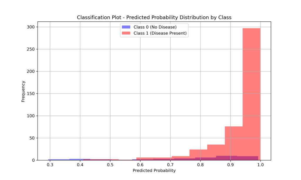
The Probability Plot displays observations along the X-axis, which represents probability from 0 to 1. The model labels each observation as 0 or 1. In an ideal model, observations cluster at the axis extremes—those labeled 0 near the 0 end, and those labeled 1 near the 1 end. This creates a characteristic U-shaped curve.
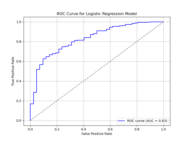
The ROC (Receiver Operating Characteristic) curve, meanwhile, illustrates the trade-off between sensitivity (true positive rate) and specificity (true negative rate) at various threshold settings. The area under this curve (AUC) provides a comprehensive measure of the model’s performance.
Analyzing Output and Results: probability and group prediction
In logistic regression, two crucial variables can be generated beyond the coefficient summary: predicted probability and group membership. These aren’t mere model outputs; they can be added as new columns to the original dataset, offering case-by-case insights.
- Predicted probability: This variable represents the model’s estimated probability for each observation to belong to the category of interest (typically coded as 1). Values range from 0 to 1.
- Group membership: This variable categorizes each observation based on its predicted probability. A threshold (often 0.5) is used to assign observations to one of two groups. Observations with predicted probabilities above the threshold are assigned to group 1; otherwise, they’re assigned to group 0.
These variables are particularly valuable for:
- Assessing model performance at the individual observation level
- Identifying noteworthy or anomalous cases
- Creating informative visualizations, such as classification plots
By incorporating these columns into the original dataset, researchers can conduct more nuanced analyses and better interpret logistic model results.
Analyzing Output and Results: Influences
Influences estimate the impact of each single observation on the outcome. Essentially, they show how the regression coefficient would change if a specific observation (e.g., a particular patient) were excluded from the analysis.
Influences help identify outliers (influential observations or leverage points) and assess their effect on the analysis. Several methods exist to evaluate these influences:
- DFBETAS: Measures the change in coefficient if a specific observation were removed
- DFFITS: Assesses the change in the model’s prediction if a specific observation were removed
- Leverage: Indicates how far an observation deviates from other observations
- Cook’s distance: Combines aspects of DFBETAS and Leverage
Measuring influences isn’t always necessary in logistic regression. It’s particularly useful when Exploratory Data Analysis graphs reveal extreme values, in models with numerous independent variables, or in cases with few observations where a single extreme value could significantly impact the analysis.
Analyzing Output and Results: Residuals
In logistic regression, evaluating residuals is one method to assess the model’s goodness of fit. Residuals represent the difference between observed values and those predicted by the model.
There are several ways to calculate residuals:
- Unstandardized residuals: The raw difference between observed and predicted values, without further processing.
- Standardized residuals: Unstandardized residuals normalized by dividing them by the standard deviation of the residuals.
- Deviance residuals: The difference between observed and predicted logits, representing the differences in log-odds.
- Studentized residuals: Another form of standardized residuals, divided by an estimated variance value.
Residuals help us better understand the model. Though not essential, they’re useful for evaluating the model’s fit and detecting anomalies.
Typically, it’s sufficient to start by examining unstandardized residuals to identify potential issues before considering other types.
Analyzing Output and Results: Hosmer and Lemeshow Test
The Hosmer-Lemeshow test compares the model’s predicted probabilities with the actual frequencies observed in the dataset. Typically, the dataset is divided into groups, and for each group, the ratio of observed to predicted events is examined.
This analysis produces a chi-square test. If the test is not significant, it indicates that the predicted numbers closely match the observed numbers, suggesting the model has good predictive capacity. Conversely, a significant test result implies a discrepancy between observations and predictions, indicating that the model doesn’t perform well.
This test is thus used to assess the model’s goodness of fit.
Logistic Regression: Comparing Traditional Statistical and Machine Learning Approaches
When performing logistic regression using a traditional statistical approach, as commonly seen in econometrics or medical research, the entire dataset is analyzed as a whole. The primary goal here isn’t prediction, but rather inference—understanding the relationship between independent and dependent variables. Coefficient analysis is key to interpreting these relationships.
In contrast, Machine Learning focuses on creating models that predict dependent variables based on unseen independent variables. This approach typically involves splitting the dataset into training and test sets. The model is developed using the training set and then evaluated on the unseen test set. The goal is to build a model that can generalize knowledge from the dataset and apply it to new, unseen data. Common model metrics include accuracy, ROC curves, and precision-recall.
Logistic Regression in Python: The Traditional Statistical Approach
In the following section, we’ll use Python to construct a comprehensive logistic regression analysis using a traditional statistical approach. We’ll explore the alternative approach in the website’s Machine Learning section.
Import library:
import numpy as np
import pandas as pd
import statsmodels.api as sm
from scipy.stats import chi2
import matplotlib.pyplot as plt
from sklearn.metrics import roc_curve, roc_auc_score
Create a synthetic dataset using age, blood pressure, and cholesterol as independent variables, with heart disease as the dependent variable.
# Generate a synthetic dataset
np.random.seed(0)
n_samples = 500
age = np.random.randint(20, 80, size=n_samples)
blood_pressure = np.random.normal(120, 15, n_samples).astype(int)
cholesterol = np.random.normal(200, 50, n_samples).astype(int)

# Dependent variable (binary outcome)
odds = -5 + 0.05 * age + 0.03 * blood_pressure + 0.01 * cholesterol
probability = 1 / (1 + np.exp(-odds))
heart_disease = np.random.binomial(1, probability)

# Creating the DataFrame
df = pd.DataFrame({
    'Age': age,
    'Blood_Pressure': blood_pressure,
    'Cholesterol': cholesterol,
    'Heart_Disease': heart_disease
})

df
Fit the logistic regression using all data
# Fit the logistic regression model using all data
X = sm.add_constant(df[['Age', 'Blood_Pressure', 'Cholesterol']])
y = df['Heart_Disease']
logit_model = sm.Logit(y, X).fit(disp=False)
Display model summary with coefficients, p values and -2LL
print(logit_model.summary())
# Extract the log-likelihood and calculate -2 Log-Likelihood
log_likelihood = logit_model.llf
neg2_log_likelihood = -2 * log_likelihood
print(f"\nLog-Likelihood: {log_likelihood}")
print(f"-2 Log-Likelihood: {neg2_log_likelihood}")
Hosmer-Lemeshow test to assess the goodness of fit
predicted_probabilities = logit_model.predict(X)
df['predicted'] = predicted_probabilities
df['group'] = pd.qcut(df['predicted'], 10, labels=False)

# Calculating observed and expected frequencies in each decile
observed = df.groupby('group')['Heart_Disease'].sum()
expected = df.groupby('group')['predicted'].sum()
group_size = df.groupby('group').size()

# Calculating Hosmer-Lemeshow statistic
hl_statistic = ((observed - expected) ** 2 / expected +
                (group_size - observed - (group_size - expected)) ** 2 / (group_size - expected)).sum()
df_hl = 10 - 2
p_value = 1 - chi2.cdf(hl_statistic, df_hl)

print(f"\nHosmer-Lemeshow Test:\nChi-square: {hl_statistic}\np-value: {p_value}")
Classification Plot
plt.figure(figsize=(10, 6))
plt.hist(df['predicted'][df['Heart_Disease'] == 0], bins=10, alpha=0.5, label='Class 0 (No Disease)', color='blue')
plt.hist(df['predicted'][df['Heart_Disease'] == 1], bins=10, alpha=0.5, label='Class 1 (Disease Present)', color='red')
plt.xlabel("Predicted Probability")
plt.ylabel("Frequency")
plt.title("Classification Plot - Predicted Probability Distribution by Class")
plt.legend(loc="upper center")
plt.grid(True)
plt.show()
Roc curve
# Predict probabilities for the ROC curve
predicted_probabilities = logit_model.predict(X)

# Calculate ROC curve and AUC
fpr, tpr, _ = roc_curve(y, predicted_probabilities)
roc_auc = roc_auc_score(y, predicted_probabilities)

# Plot the ROC curve
plt.figure(figsize=(8, 6))
plt.plot(fpr, tpr, color='blue', label=f'ROC curve (AUC = {roc_auc:.2f})')
plt.plot([0, 1], [0, 1], color='grey', linestyle='--')  # Diagonal line for reference
plt.xlabel("False Positive Rate")
plt.ylabel("True Positive Rate")
plt.title("ROC Curve for Logistic Regression Model")
plt.legend(loc="lower right")
plt.grid(True)
plt.show()


