Francis Galton (1822-1911), Charles Darwin’s cousin, was a multifaceted British scientist who explored diverse fields of study.
Galton observed that certain variables tended to change in tandem—altering one would lead to changes in the other. He pioneered the formalization of the concept of “correlation”.

Another of Galton’s key insights pertained to the relationship between parents’ and children’s heights. He noticed that offspring of exceptionally tall parents often tended to be shorter, while those of shorter parents were frequently taller. This phenomenon suggested a force that, starting from extreme measurements, seemed to pull towards the average—a concept he termed “regression towards the mean,” or simply “regression.”
Correlation
Correlation is a statistical measure that expresses the strength and direction of the linear relationship between two variables. It helps us understand how changes in one variable are associated with changes in another. Correlation is formally quantified by the correlation coefficient, which ranges from -1 to +1:
- A value of +1 indicates a perfect positive correlation: as one variable increases, the other increases proportionally.
- A value of -1 indicates a perfect negative correlation: as one variable increases, the other decreases proportionally.
- A value of 0 indicates no linear correlation: there’s no linear relationship between the two variables.

The strength of the relationship between variables can be quantified and interpreted using the correlation coefficient’s value. This numerical measure provides insight into both the direction and magnitude of the association between variables. Generally, a correlation coefficient greater than 0.7 or less than -0.7 is considered to indicate a strong relationship, suggesting that changes in one variable are closely linked to changes in the other.
It’s important to note, however, that the interpretation of correlation strength can vary depending on the context and field of study. In some disciplines, correlations above 0.5 or below -0.5 might be considered strong, while in others, only those above 0.8 or below -0.8 are deemed significant. Researchers should always consider the specific nature of their data and the standards of their field when interpreting correlation strength.
While strong correlations can be informative, extremely high correlations—those above 0.9 or below -0.9—warrant scrutiny. Such unusually strong relationships might indicate multicollinearity issues, particularly in regression analyses. Multicollinearity occurs when predictor variables are highly correlated with each other, which can lead to unstable and unreliable estimates in statistical models. In these cases, it may suggest that the variables are measuring nearly identical constructs or that there might be redundancy in the data collection process.
While correlation does not establish a cause-effect relationship between the examined variables, its presence serves as a crucial foundation for further investigation into potential causal connections. The existence of a correlation between two variables indicates that there is some form of association or dependency between them, which is a necessary precondition for any cause-effect relationship. Without a correlation, it becomes highly improbable, if not impossible, to establish a meaningful causal link between variables.
The presence of correlation encourages further exploration, hypothesis formulation, and rigorous testing to uncover the true nature of the relationship between variables.
A correlation must make sense conceptually before being confirmed through calculation. Otherwise, we risk encountering what are known as “spurious correlations”—apparent relationships that lack genuine meaning or significance.
One of the most famous sources of spurious correlations is Tyler Vigen’s “Spurious Correlations” project. This collection showcases absurd correlations between unrelated real-world variables, such as:
- U.S. spending on science, space, and technology vs. suicides by hanging
- Cheese consumption per capita vs. number of people who died by becoming tangled in their bedsheets
- Number of pool drownings vs. Nicolas Cage movie appearances
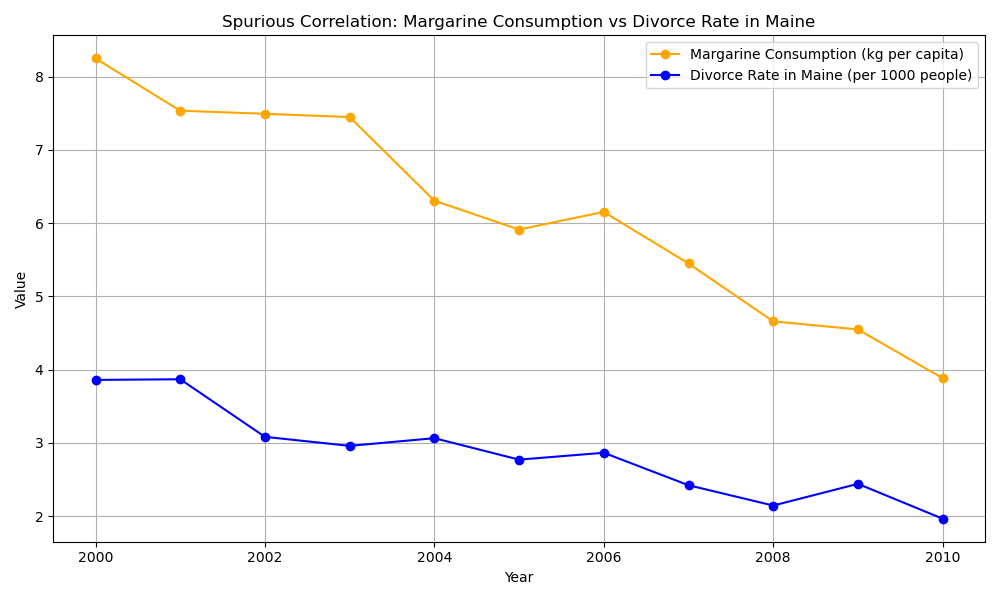
Another essential aspect of correlation is its expression as the coefficient of determination (r²), which equals the square of the correlation coefficient. This measure helps us understand how much of the dependent variable’s variability is explained by the independent variable.
To clarify, the correlation coefficient (r) indicates the existence, strength, and direction of the relationship between variables, ranging from -1 to +1. The coefficient of determination (r²), on the other hand, represents the proportion of variance in one variable that can be explained by the variance in another. Its value ranges from 0 (no explanatory power) to 1 (complete explanation of variability).
Measures of association distinguish themselves from correlation measures through their emphasis on variable dependency. These measures operate under the assumption that there are distinct independent and dependent variables within the relationship being analyzed. A key differentiating factor is that association measures do not necessitate a linear relationship between the variables under examination, which is often a requirement for correlation measures. Furthermore, association measures typically employ non-parametric statistical methods, allowing for greater flexibility in data analysis. It’s important to note, however, that the distinctions between these two types of measures are not always rigid. Both correlation and association measures can, in certain circumstances, be adapted to handle non-linear relationships between variables. Additionally, while association measures are predominantly non-parametric, some correlation measures can also utilize non-parametric methods when the data doesn’t meet the assumptions required for parametric analysis.
How many types of correlation are there?
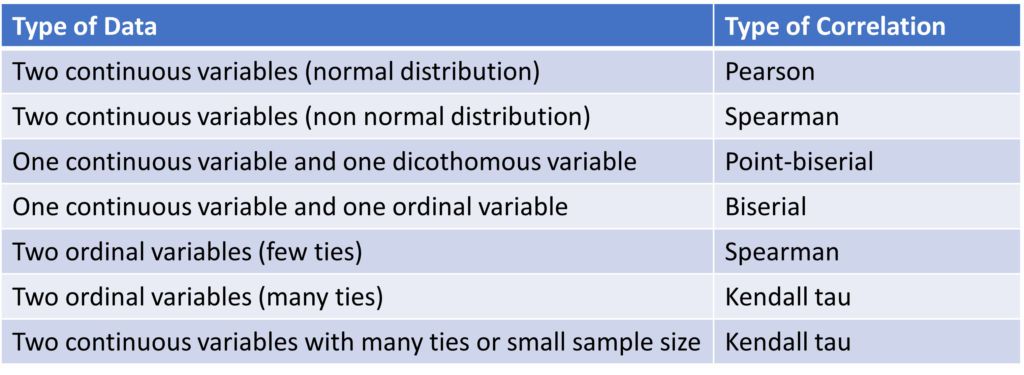
Various types of correlations exist, each applicable to different combinations of variable types.
The Pearson coefficient, also known as Pearson’s Product Moment Correlation Coefficient (PPMCC), is the oldest and most widely used type of correlation. It serves as the foundation for many other correlation types.
Other types of correlation include biserial, point-biserial, Spearman’s rho, Kendall’s tau, and phi coefficient.
The graph below illustrates various data types for variables undergoing correlation analysis and indicates the appropriate correlation method for each combination.
Pearson’s coefficient (Pearson’s Product Moment Correlation Coefficient = PPMCC)
Karl Pearson (1857-1936), a British mathematician and statistician, made substantial contributions to the development of modern statistics. He not only developed the correlation coefficient in 1896 but also introduced the chi-square test and made significant contributions to the field of linear regression.

The “Product Moment Correlation Coefficient” derives its name from its calculation method. It’s based on the product of the variables’ central moments divided by the number of pairs.
The Pearson coefficient applies to quantitative variables that exhibit a linear relationship and normal distribution, without outliers. Moreover, it requires a minimum of 30 observations to be valid.
The following code demonstrates the creation of a simulated dataset using a typical clinical scenario: examining the relationship between blood pressure and cholesterol levels. It then calculates the Pearson coefficient and generates a scatter plot using Python libraries numpy, scipy, and matplotlib.
import numpy as np
import matplotlib.pyplot as plt
from scipy import stats

# Generate fake medical data
np.random.seed(42)
num_patients = 100

# Blood pressure (systolic) in mmHg
blood_pressure = np.random.normal(120, 15, num_patients)

# Cholesterol levels in mg/dL
cholesterol = np.random.normal(200, 30, num_patients)

# Add some correlation
cholesterol += 0.5 * (blood_pressure - 120)

# Calculate Pearson correlation coefficient
correlation, p_value = stats.pearsonr(blood_pressure, cholesterol)

# Create a scatter plot
plt.figure(figsize=(10, 6))
plt.scatter(blood_pressure, cholesterol, alpha=0.5)
plt.xlabel('Blood Pressure (mmHg)')
plt.ylabel('Cholesterol (mg/dL)')
plt.title('Blood Pressure vs. Cholesterol')

# Add correlation line
z = np.polyfit(blood_pressure, cholesterol, 1)
p = np.poly1d(z)
plt.plot(blood_pressure, p(blood_pressure), "r--", alpha=0.8)

# Add text with correlation coefficient
plt.text(0.05, 0.95, f'Correlation: {correlation:.2f}', transform=plt.gca().transAxes)

# Print results
print(f"Pearson correlation coefficient: {correlation:.2f}")
print(f"P-value: {p_value:.4f}")
plt.show()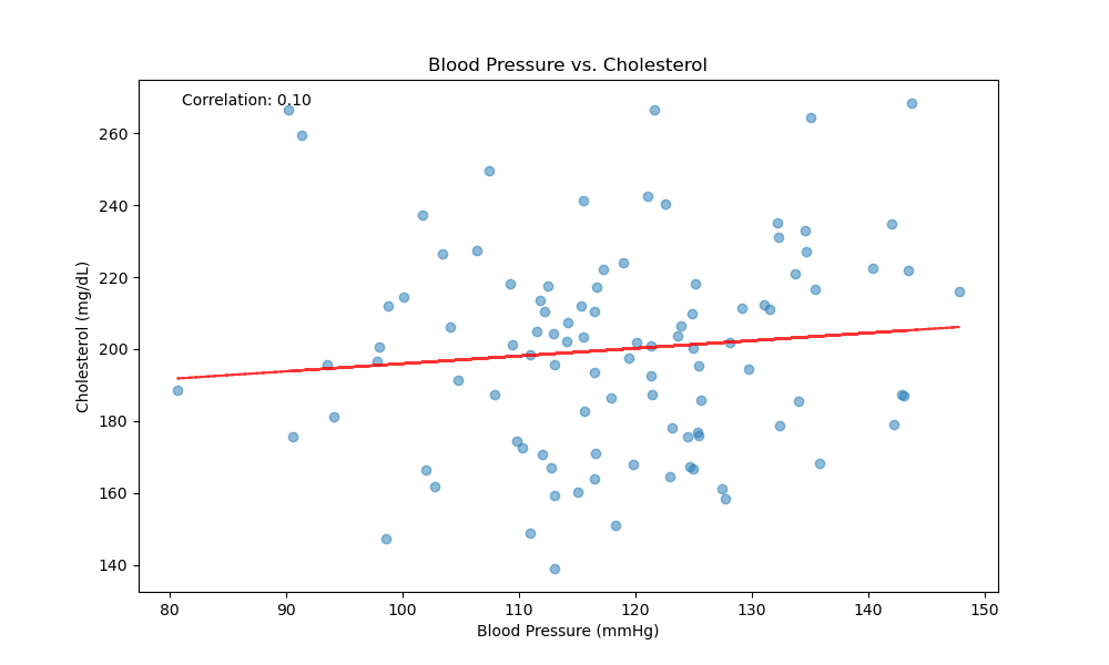
Biserial and Point-Biserial Correlation
Biserial correlation is less frequently used than Pearson correlation as it applies to specific cases where one variable is discrete or ordinal. In such scenarios, researchers typically prefer to assess the difference between the means of the continuous variable for each value of the discrete variable, rather than evaluating their correlation. Consequently, other statistical methods like t-tests or ANOVA are often favored.
For discrete variables, the type of correlation applied depends on their nature. Biserial correlation is used when the variable is ordinal, while point-biserial correlation is employed for dichotomous variables (such as true/false or yes/no).
In the following example, we’ll create a simulated dataset with a continuous variable (blood glucose levels) and a discrete variable (diabetes diagnosis). We’ll then apply biserial and point-biserial correlation using Python libraries:
import pandas as pd
import numpy as np
import scipy.stats as stats
import matplotlib.pyplot as plt
import seaborn as sns

# Step 1: Create a Fake Medical Database
data = {
    'Age': np.random.randint(20, 80, 200),  # Age between 20 and 80
    'Blood_Pressure': np.random.randint(100, 180, 200),  # Blood pressure values between 100 and 180
    'Smoker': np.random.choice([0, 1], 200),  # Binary: 0 for Non-Smoker, 1 for Smoker
    'Cholesterol_Level': np.random.randint(150, 300, 200),  # Cholesterol levels between 150 and 300
    'Heart_Disease_Severity': np.random.choice([0, 1, 2, 3], 200),  # Ordinal: 0 = None, 1 = Mild, 2 = Moderate, 3 = Severe
}

# Create a DataFrame
df = pd.DataFrame(data)

# Step 2: Calculate Point-Biserial Correlation
# Point-Biserial correlation between 'Smoker' (binary) and 'Blood_Pressure'
point_biserial_corr, _ = stats.pointbiserialr(df['Smoker'], df['Blood_Pressure'])
print(f"Point-Biserial Correlation between 'Smoker' and 'Blood Pressure': {point_biserial_corr:.2f}")

# Step 3: Calculate Biserial Correlation (Approximation)
# Biserial correlation between 'Heart_Disease_Severity' (ordinal) and 'Age'
# Biserial correlation is not directly implemented in scipy, but can be approximated as follows:
severity_0 = df[df['Heart_Disease_Severity'] == 0]['Age']
severity_1 = df[df['Heart_Disease_Severity'] == 1]['Age']
severity_2 = df[df['Heart_Disease_Severity'] == 2]['Age']
severity_3 = df[df['Heart_Disease_Severity'] == 3]['Age']

mean_0 = severity_0.mean()
mean_1 = severity_1.mean()
mean_2 = severity_2.mean()
mean_3 = severity_3.mean()

# For simplicity, we'll calculate an average mean difference to approximate the biserial correlation
mean_diff = (mean_1 + mean_2 + mean_3) / 3 - mean_0
std_dev = df['Age'].std()

prop_0 = len(severity_0) / len(df)
prop_1 = (len(severity_1) + len(severity_2) + len(severity_3)) / len(df)

biserial_corr = (mean_diff) / std_dev * np.sqrt(prop_0 * prop_1)
print(f"Biserial Correlation between 'Heart Disease Severity' and 'Age': {biserial_corr:.2f}")

# Step 4: Visualization
# Combined Visualization in a Single Canvas, arranged vertically side by side
plt.figure(figsize=(16, 6))

# Point-Biserial Correlation Plot
plt.subplot(1, 2, 1)
sns.boxplot(x='Smoker', y='Blood_Pressure', data=df)
plt.title("Blood Pressure by Smoking Status")
plt.xlabel("Smoker (0 = No, 1 = Yes)")
plt.ylabel("Blood Pressure")

# Biserial Correlation Plot
plt.subplot(1, 2, 2)
sns.boxplot(x='Heart_Disease_Severity', y='Age', data=df)
plt.title("Age by Heart Disease Severity")
plt.xlabel("Heart Disease Severity (0 = None, 1 = Mild, 2 = Moderate, 3 = Severe)")
plt.ylabel("Age")

plt.tight_layout()
plt.show()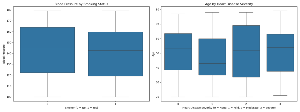
Spearman’s Rank Order Correlation Coefficient (Rho)
Spearman’s Rank Order Correlation Coefficient is a widely recognized statistical method for analyzing the relationship between two ordinal variables.
For the Spearman correlation to be applicable, both variables must be ordinal, meaning they can be ranked or ordered. This includes data types such as Likert scales, rankings, or any other form of ordered categorical data. Additionally, the relationship between the variables must be monotonic, which implies that as one variable increases, the other variable consistently either increases or decreases, without changing direction. This monotonicity requirement is less stringent than the linearity assumption in Pearson’s correlation, allowing Spearman’s method to capture a broader range of relationships.
Spearman’s correlation uses ranks and ties as the basis for calculations.
The rank of a value in a dataset is its ordinal position relative to the other values in the sample.
For example, if a variable contains the values 7, 8, 4, 2, 1, to calculate the ranks we must first order the values, which then become: 1, 2, 4, 7, 8. Then we assign a rank to each value in ascending order. The final result will be:
- Value: 1 = rank: 1
- Value: 2 = rank:2
- Value 4 = rank: 3
- Value 7 = rank: 4
- Value 8 = rank: 5
Ties account for how often a value repeats in a variable. Let’s consider our earlier example with additional values: 7, 8, 4, 2, 1, 4, 8, 4. We first order the data: 1, 2, 4, 4, 4, 7, 8, 8.
Next, we assign initial ranks:
- value 1 = rank 1
- value 2 = rank 2
- value 4 = rank 3
- value 4 = rank 4
- value 4 = rank 5
- value 7 = rank 6
- value 8 = rank 7
- value 8 = rank 8
However, we now have identical values with different ranks. To resolve this, we assign each value the average of its ranks. For value 4, the average rank is (3+4+5)/3 = 4. For value 8, it’s (7+8)/2 = 7.5. The final result:
- value 1 = rank 1
- value 2 = rank 2
- value 4 = rank 4
- value 4 = rank 4
- value 4 = rank 4
- value 7 = rank 6
- value 8 = rank 7.5
- value 8 = rank 7.5
The presence or absence of numerous ties can guide our choice of statistical method. When dealing with many ties and few data points, Kendall’s methods are often preferable.
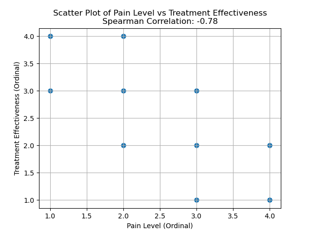
In the following example, we create a simulated dataset with two ordinal variables: a pain severity scale and a treatment effectiveness scale. We then analyze these data using Spearman’s rank correlation technique.
import numpy as np
import pandas as pd
import matplotlib.pyplot as plt
from scipy.stats import spearmanr

# Generate a fake medical dataset
np.random.seed(42)
n = 100

# Fake medical data with ordinal values
# For example: Pain Level (ordinal) vs Treatment Effectiveness (ordinal)
# Pain Level: 1 (Low), 2 (Moderate), 3 (High), 4 (Severe)
pain_level = np.random.choice([1, 2, 3, 4], size=n)

# Treatment Effectiveness: 1 (Poor), 2 (Fair), 3 (Good), 4 (Excellent)
# Assuming some relationship with pain level (e.g., higher pain might correspond to lower effectiveness)
treatment_effectiveness = 5 - pain_level + np.random.choice([-1, 0, 1], size=n)

# Clipping the values to ensure they stay within the range of 1 to 4
treatment_effectiveness = np.clip(treatment_effectiveness, 1, 4)

# Create a DataFrame
data = pd.DataFrame({
    'Pain_Level': pain_level,
    'Treatment_Effectiveness': treatment_effectiveness
})

# Calculate Spearman correlation
spearman_corr, p_value = spearmanr(data['Pain_Level'], data['Treatment_Effectiveness'])
print(f"Spearman Correlation: {spearman_corr:.2f}")
print(f"P-value: {p_value:.4f}")

# Plot the data
plt.scatter(data['Pain_Level'], data['Treatment_Effectiveness'], alpha=0.7)
plt.title(f"Scatter Plot of Pain Level vs Treatment Effectiveness\nSpearman Correlation: {spearman_corr:.2f}")
plt.xlabel('Pain Level (Ordinal)')
plt.ylabel('Treatment Effectiveness (Ordinal)')
plt.grid(True)
plt.show()
In this specific example, a negative output (e.g., around -0.78) suggests an inverse relationship between pain level and treatment effectiveness. This means that as pain levels increase, the effectiveness of treatment tends to decrease, aligning with the assumption that higher pain might be associated with less effective treatments. A p-value < 0.05 indicates the statistical significance of the results.
Kendall coefficients
The Kendall coefficients—of which there are several for different situations—were developed by Sir Maurice George Kendall.
Kendall’s tau is a statistical measure employed in specific scenarios involving ordinal variables. Unlike Spearman’s rho, it is particularly useful when dealing with smaller sample sizes (typically less than 30 observations) and datasets containing a substantial number of tied ranks. This makes Kendall’s tau more robust in certain situations where Spearman’s rho might be less reliable. Additionally, Kendall’s tau is often preferred when analyzing variables within a population context, as it provides a different interpretation of the relationship between variables compared to Spearman’s rho.
To apply Kendall’s tau, two key requirements must be met:
- The variables must be ordinal. This includes measures like Likert scales.
- There must be a monotonic relationship between the variables.
Kendall’s tau, like other correlation coefficients, ranges from -1 to +1. A positive correlation indicates that higher ranks in one variable correspond to higher ranks in the other. Conversely, a negative correlation means that higher ranks in one variable are associated with lower ranks in the other.
There are three types of Kendall coefficients:
- Kendall’s tau-a: Rarely used, it applies when there are no ties or tied ranks. In these cases, Spearman’s correlation is often preferred.
- Kendall’s tau-b: Used when there are many ties or tied ranks and when the contingency table is square (i.e., there’s a similar number of columns and rows).
- Kendall’s tau-c: Applied when there are many ties or tied ranks and when the contingency table is rectangular (i.e., there’s a different number of columns and rows).
Kendall’s W, also known as Kendall’s coefficient of concordance, is a measure of reliability used to assess agreement among multiple raters.
The criteria must be 3 or more, and the judges are treated as data (in a column). The result ranges from 0 (no agreement) to 1 (total agreement).
Photos from Wikimedia Commons


