Following our general introduction to the matplotlib environment, let’s explore the types of graphs this Python library can produce.
Among the most commonly used graphs for data presentation are:
- Histograms
- Box plots
- Scatter plots
- Bar charts
- Line graphs
Histograms
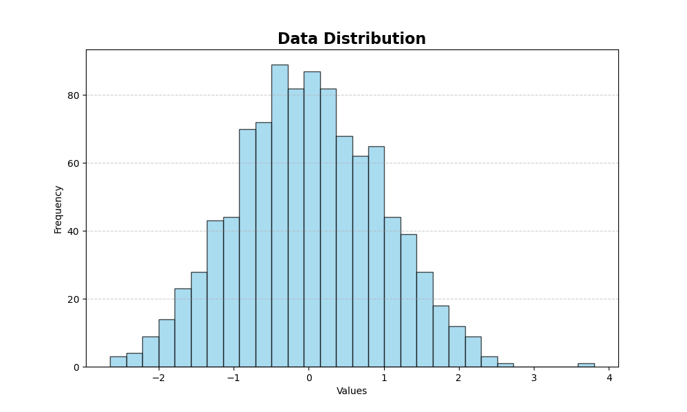
Histograms primarily illustrate the distribution of a continuous variable. The data is divided into uniform intervals (bins), and the frequency of each bin is represented.
You can create histograms using the following function:
plt.hist()
This function accepts several arguments:
- bins: number of intervals for dividing the data
- color and edgecolor: fill color of the bars and color of their edges
- alpha: controls the transparency of the bars
The following program generates a series of data with normal distribution and displays them using histograms:
import matplotlib.pyplot as plt
import numpy as np

# Create a random dataset with normal distribution
data = np.random.randn(1000)

# Create a histogram
plt.figure(figsize=(10, 6))
plt.hist(data, bins=30, color='skyblue', edgecolor='black', alpha=0.7)

# Add title and labels
plt.title('Data Distribution', fontsize=16, fontweight='bold')
plt.xlabel('Values')
plt.ylabel('Frequency')
plt.grid(axis='y', linestyle='--', alpha=0.6)

plt.show()
The resulting graph looks as follows:
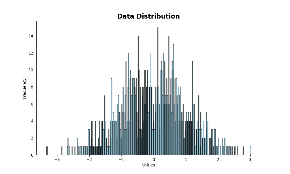
To increase the detail of the distribution, we can increase the number of bins. In the following example, we’ve increased the number of bins from 30 to 300:
Box Plots
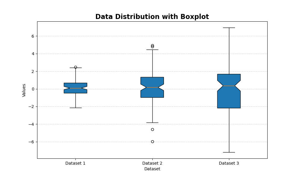
Box plots (also known as box-and-whisker plots) are ideal for highlighting the distribution of continuous variables in quartiles. The box shows the data ranging from the first to the third quartile, with the median highlighted. Outliers are also displayed.
Box plots are created with the function:
plt.boxplot()
The key parameters are:
- data: the variable containing the values
- patch_artist: boolean, indicates whether the box plot should be filled with colors
- notch: boolean, indicates the confidence interval of the median
- vert: boolean, specifies whether the graph should be oriented vertically
Let’s create a box plot using normally distributed data. We’ll generate a list (data) containing three groups of 100 random numbers. Each group will have a mean of 0 and standard deviations of 1, 2, and 3 respectively.
np.random.seed(10)  # Set a seed for reproducibility
data = [np.random.normal(0, std, 100) for std in range(1, 4)]

# Create the boxplot
plt.figure(figsize=(10, 6))
plt.boxplot(data, patch_artist=True, notch=True, vert=True)

# Add title and labels
plt.title('Data Distribution with Boxplot', fontsize=16, fontweight='bold')
plt.xlabel('Dataset')
plt.ylabel('Values')
plt.xticks([1, 2, 3], ['Dataset 1', 'Dataset 2', 'Dataset 3'])
plt.grid(axis='y', linestyle='--', alpha=0.6)

plt.show()
The resulting graph will look like this:
Scatter Plots
Scatter plots are used to highlight relationships between two variables, revealing trends and correlations. They’re particularly useful for visualizing how one variable changes to another.
To generate a scatter plot, use the following function:
plt.scatter()
The key parameters for this function are:
- x and y: the variables containing the values to be compared
- color and edgecolor: colors of the points and their borders
- alpha: transparency level, which can help highlight overlapping points
Here’s an example of how to create a scatter plot comparing two variables:
np.random.seed(0)
x = np.random.rand(100)
y = 2 * x + np.random.normal(0, 0.1, 100)

plt.figure(figsize=(10, 6))
plt.scatter(x, y, color='teal', alpha=0.7, edgecolor='k')

# Add title and labels
plt.title('Scatter Plot', fontsize=16, fontweight='bold')
plt.xlabel('X Variable')
plt.ylabel('Y Variable')
plt.grid(True, linestyle='--', alpha=0.6)

plt.show()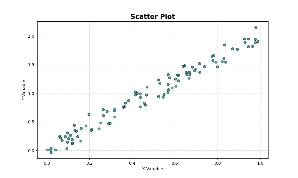
Bar Charts
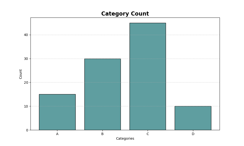
Bar charts effectively display the count or frequency of categorical data. They provide a clear visual representation of data categories and their corresponding values.
To generate a bar chart, use the following function:
plt.bar()
This function accepts several key parameters:
- categories, values: pairs of categories and their corresponding counts or frequencies
- color: fill color of the bars
- edgecolor: color of the bar borders
Here’s an example of code generating a bar chart:
categories = ['A', 'B', 'C', 'D']
values = [15, 30, 45, 10]

plt.figure(figsize=(10, 6))
plt.bar(categories, values, color='cadetblue', edgecolor='black')

# Add title and labels
plt.title('Category Count', fontsize=16, fontweight='bold')
plt.xlabel('Categories')
plt.ylabel('Count')
plt.grid(axis='y', linestyle='--', alpha=0.6)

plt.show()
The resulting graph looks like this:
Line Graph
Line graphs are ideal for showing time series.
By indicating time intervals on the x-axis, we can see how values change over time.
The command that allows us to create line graphs is:
plt.plot()
which accepts as parameters:
- date, values: pair of date and values on that date
- colors and other parameters to adjust the graphical appearance
Here’s an example of a line graph:
dates = np.arange('2024-01', '2024-06', dtype='datetime64[D]')
values = np.random.randn(len(dates)).cumsum()

plt.figure(figsize=(12, 6))
plt.plot(dates, values, color='dodgerblue', linewidth=2)

# Add title and labels
plt.title('Time Series', fontsize=16, fontweight='bold')
plt.xlabel('Date')
plt.ylabel('Cumulative Value')
plt.xticks(rotation=45)
plt.grid(True, linestyle='--', alpha=0.6)

plt.show()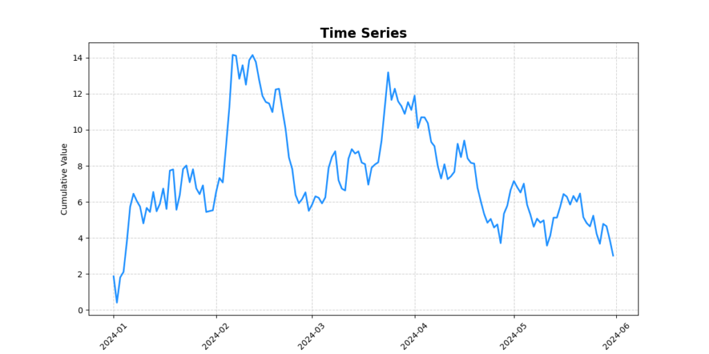
The already impressive capabilities of matplotlib can be significantly enhanced by incorporating the Seaborn library. Built upon matplotlib’s foundation, Seaborn offers a user-friendly approach to creating intricate and visually appealing graphs. This powerful combination allows data scientists and analysts to effortlessly generate complex visualizations, expanding the range of possibilities for data representation and analysis.
