Python offers several libraries for creating professional graphs, but Matplotlib stands out as the foundation upon which many others are built. Often referred to by its alias “plt,” Matplotlib enables users to generate complex, element-rich graphs as well as multiple visualizations. Another popular library, Seaborn (alias “sns”), functions as an extension of Matplotlib and requires its installation to operate. Seaborn enhances both procedural management and graphical handling compared to Matplotlib. In this article, we’ll explore Matplotlib, beginning with its fundamental concepts and progressing to the development of more sophisticated statistical graphs.
Installation and Importing Matplotlib
To install Matplotlib, enter the following command in your terminal:
pip install matplotlib
It’s best to perform this installation within a virtual environment.
After installation, import the library into your Python program with:
import matplotlib.pyplot as plt
Conventionally, Matplotlib is aliased as “plt”. Note that we typically import the pyplot module directly. This module offers functionality similar to MATLAB—a widely used program in scientific and technical fields—and provides access to advanced graphing functions.
Figure, Axes, and Plot
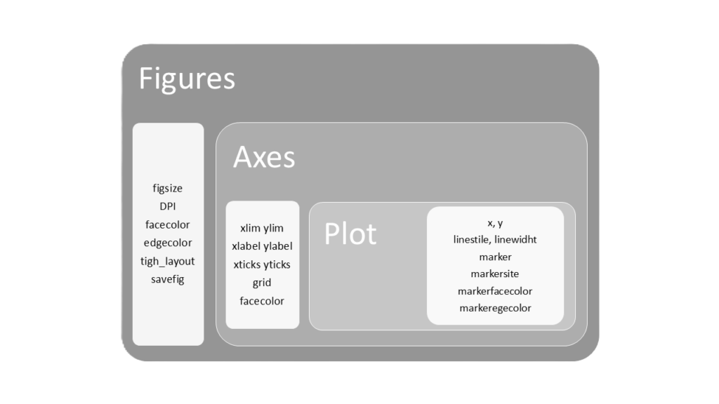
To fully comprehend Matplotlib, it’s crucial to understand the relationship between figure, axes, and plot.
The figure is the entire window or area of the graph we’re creating—the foundation for any Matplotlib visualization. Without it, we’d have nowhere to place our graphs. Think of it as an artist’s blank canvas: it’s the space where all our graphical elements come to life. A single figure can house one or more graphs, enabling complex, multi-dimensional visualizations. Far from being a passive container, the figure actively shapes how we organize and present our data.
Axes represent individual drawing areas within a figure, each containing a specific graph. This structure offers great flexibility. In its simplest form, we might have a single axes within a figure. But the real power emerges when creating complex visualizations—a single figure can host multiple axes, allowing us to present two, three, or more graphs simultaneously. This feature is particularly useful for comparing different datasets or showing various perspectives of the same information, providing a comprehensive view of our data.
Plot is the key function that brings our data to life on an axes. It’s the heart of Matplotlib’s graphic creation, transforming abstract numbers into visual representations. With plot, we define not only the basic shape of our graph—whether lines, points, or bars—but also customize every aspect of the visualization. This includes colors, line styles, point sizes, and even element transparency.

Figure
Moving on to practical aspects, the creation of a figure is done by specifying its dimensions as a parameter:
fig = plt.figure(figsize=(10,6))
fig is the figure we have created using the plt.figure module; figsize is the parameter that allows us to specify its dimensions. In this specific case, we have created a figure, called fig, with dimensions of 10 x 6 inches.
Other parameters that can be applied to figure are:
- dpi: resolution of the figure in dots per inch
- facecolor: background color
- edgecolor: border color
- tight_layout: optimizes the layout of contents
- savefig: saves the entire figure in various formats (e.g., savefig(“figure.png”, dpi=300, transparent=True saves the figure with the specified name and format, with a resolution of 300 dpi and with a transparent background)
Axes
To add an axes to our figure, we use the add_subplot method:
ax = fig.add_subplot(1,1,1)
ax is the axes we have created on the figure fig. The axis is positioned on the first row, first column, and is the first graph of the figure (1,1,1) which, in the case of single graphs, is also the only axes present.
If we want to use only one axes, we don’t even need to create it. It is generated automatically. We just need to create a figure and start plotting.
Every time we create a figure, it becomes the active figure and all subsequent graphical commands will refer to it. If we want to create multiple figures and switch between them when adding graphical elements, we can identify the figure with a number (figure(1), for example) and recall it whenever we want to work on it:
# Create a figure with a graph
plt.figure(1)
plt.plot([1, 2, 3, 4])
plt.title("Graph 1")

# Create a new figure with another graph
plt.figure(2)
plt.plot([4, 3, 2, 1])
plt.title("Graph 2")

# Return to the first figure and add something
plt.figure(1)
plt.xlabel("X-axis")
The subplots function allows us to create figures and axes with a single command. This versatile method works for both single and multiple graph layouts:
fig, ax = plt.subplots()
The subplots function takes three key parameters:
- nrows: number of rows (default is 1)
- ncols: number of columns (default is 1)
- figsize: dimensions of the figure in inches
# Create a single 10 x 6 inch graph
fig, ax = plt.subplots(1, 1, figsize=(10, 6))

# Create 4 graphs in a 2x2 layout on a 10 x 6 inch figure
fig, ax = plt.subplots(2, 2, figsize=(10, 6))
Compared to the older subplot method, which only allows creating one axes at a time, subplots offers greater flexibility. It’s now the preferred choice in modern Matplotlib programming.
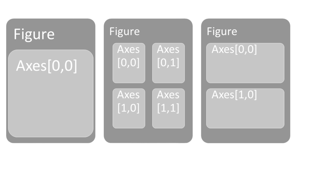
After creating a figure and one or more axes, we can begin drawing our graphs within these axes. Each axes is identified as a two-dimensional array, indicating its row and column position:
# Create a figure with 4 axes arranged in two rows and two columns
fig, ax = plt.subplots(2, 2, figsize=(10, 6))

# Draw on the first axes (top-left)
ax[0, 0].plot(...)

# Draw on the second axes (top-right)
ax[0, 1].plot(...)

# Draw on the third axes (bottom-left)
ax[1, 0].plot(...)

# Draw on the fourth axes (bottom-right)
ax[1, 1].plot(...)
Below are the layouts of the axes created with the following commands:
fig, axes = plt.subplots(1, 1, figsize=(x, x))
fig, axes = plt.subplots(2, 2, figsize=(x, x))
fig, axes = plt.subplots(2, 1, figsize=(x, x))

Several parameters can be applied to axes to customize their appearance. The most important ones are:
- set_xlim and set_ylim: Define the axis range. For example, set_xlim([0, 10]) sets the x-axis from 0 to 10.
- set_xlabel and set_ylabel: Set the axis labels.
- set_title: Set the graph title.
- set_xticks and set_yticks: Place reference marks on the axes. For example, set_xticks([1, 2, 3, 4, 5]) adds ticks at those values.
- grid: A boolean to show (True) or hide (False) the grid.
- set_facecolor: Set the background color.
- spines: Control the visibility and color of borders. For example, spine[“top”].set_visible(False) removes the top border, while spine[“right”].set_color(“blue”) colors the right border blue.
- tight_layout: Optimize the layout of multiple graphs.
- autoscale: Adjust the axes to fit the data.
- axis: Control axis visibility. axis(“off”) hides all axes, while axis(“equal”) makes axis limits equal on all axes.
Once we’ve set up the number, arrangement, and appearance of the axes (and thus the graphs) on the figure, we can proceed to draw the graphs using the plot method.
Plot
The plot function offers numerous parameters for extensive graph customization:
- x, y: Coordinates of points to plot. These are typically arrays or lists of coordinate values, not just single points.
- color: Line color. Specify using color names (“red”, “blue”), abbreviations (“r” for red, “b” for blue), or hexadecimal codes (“#FF5733”).
- linestyle (ls): Line style. Options include “-” (solid), “–” (dashed), “-.” (dash-dot), and “:” (dotted).
- linewidth (lw): Line thickness (numerical value).
- marker: Point style. Examples: “o” (circle), “s” (square), “x” (cross), “d” (diamond).
- markersize (ms): Size of markers.
- markerfacecolor (mfc): Internal color of markers.
- markeredgecolor (mec): Color of marker borders.
- label: Legend label.
- alpha: Line transparency (0 for fully transparent, 1 for fully opaque).
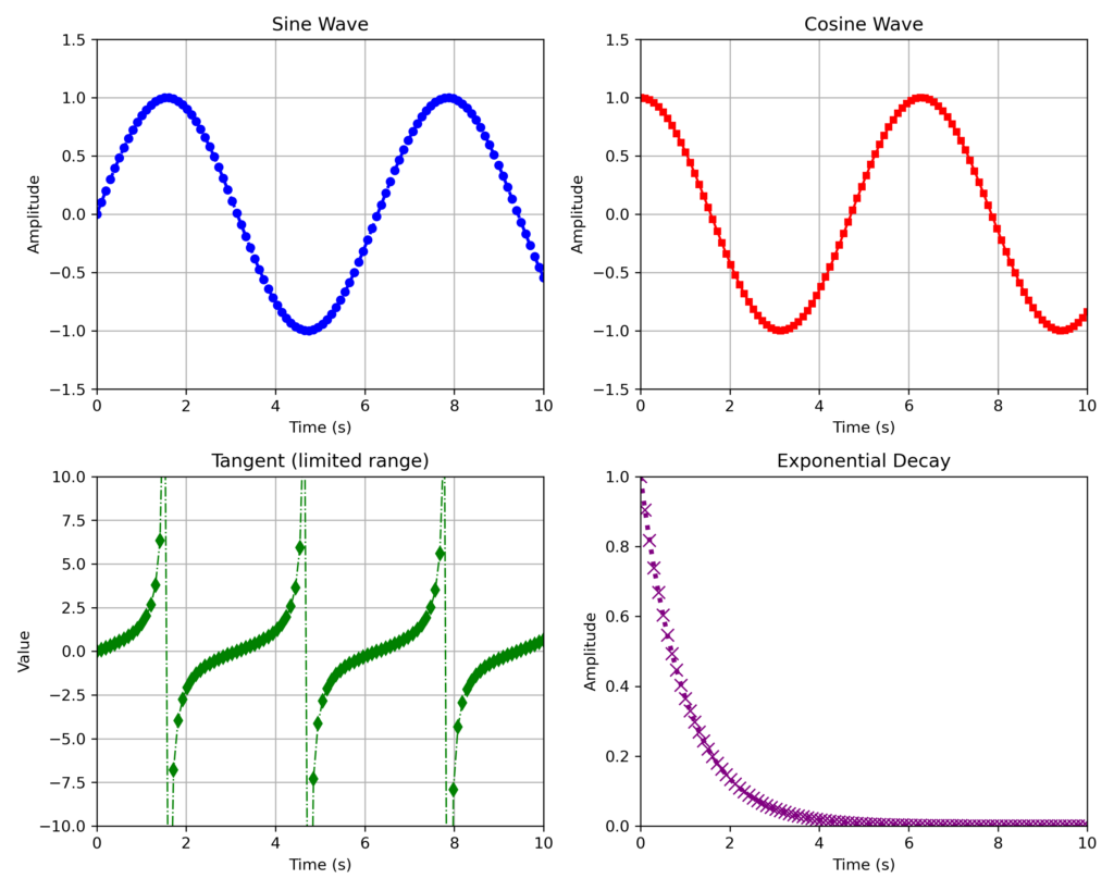
Now, let’s combine these elements to create a figure with four graphs in a 2×2 layout:
import matplotlib.pyplot as plt
import numpy as np

# Create a figure and a 2x2 grid of subplots
fig, axes = plt.subplots(2, 2, figsize=(10, 8), dpi=100)

# Generate some data to plot
x = np.linspace(0, 10, 100)
y1 = np.sin(x)
y2 = np.cos(x)
y3 = np.tan(x)
y4 = np.exp(-x)

# Plot on the first axes (axes[0, 0])
axes[0, 0].plot(x, y1, color='b', linestyle='--', linewidth=2, marker='o', markersize=5)
axes[0, 0].set_title('Sine Wave')
axes[0, 0].set_xlabel('Time (s)')
axes[0, 0].set_ylabel('Amplitude')
axes[0, 0].grid(True)
axes[0, 0].set_xlim([0, 10])
axes[0, 0].set_ylim([-1.5, 1.5])

# Plot on the second axes (axes[0, 1])
axes[0, 1].plot(x, y2, color='r', linestyle='-', linewidth=1.5, marker='s', markersize=4)
axes[0, 1].set_title('Cosine Wave')
axes[0, 1].set_xlabel('Time (s)')
axes[0, 1].set_ylabel('Amplitude')
axes[0, 1].grid(True, which='both', axis='both')
axes[0, 1].set_xlim([0, 10])
axes[0, 1].set_ylim([-1.5, 1.5])

# Plot on the third axes (axes[1, 0])
axes[1, 0].plot(x, y3, color='g', linestyle='-.', linewidth=1, marker='d', markersize=6)
axes[1, 0].set_title('Tangent (limited range)')
axes[1, 0].set_xlabel('Time (s)')
axes[1, 0].set_ylabel('Value')
axes[1, 0].set_xlim([0, 10])
axes[1, 0].set_ylim([-10, 10])
axes[1, 0].grid(True)

# Plot on the fourth axes (axes[1, 1])
axes[1, 1].plot(x, y4, color='purple', linestyle=':', linewidth=3, marker='x', markersize=8)
axes[1, 1].set_title('Exponential Decay')
axes[1, 1].set_xlabel('Time (s)')
axes[1, 1].set_ylabel('Amplitude')
axes[1, 1].set_xlim([0, 10])
axes[1, 1].set_ylim([0, 1])

# Adjust the layout to prevent overlap of labels and titles
fig.tight_layout()

# Save the figure as an image
fig.savefig('subplot_figure_subplots.png', dpi=300)

# Show the figure
plt.show()
The resulting figure will look like this:

