Formally expressed, descriptive statistics is the branch of statistics that focuses on the systematic collection, organization, summarization, and presentation of data with the primary objective of elucidating its main characteristics. This process involves employing various techniques and methods to distill large datasets into more manageable and interpretable forms, allowing researchers and analysts to gain insights into the underlying patterns and structures within the data.
In less rigid terms, we can consider descriptive statistics akin to taking a comprehensive photograph of our data. This metaphorical snapshot provides an indicative image of the data’s characteristics, enabling us to understand how the information is structured, how it varies across different dimensions, and whether it exhibits any discernible trends or patterns. By utilizing various statistical measures and visual representations, descriptive statistics offers a multi-faceted view of the data, highlighting key features such as central tendencies, dispersion, and distribution shapes.
Unlike its counterpart, inferential statistics, descriptive statistics confines itself to describing the reality of the data at hand and does not venture beyond their mere description. It focuses on summarizing and presenting the information within a specific dataset without attempting to draw broader conclusions or make predictions about larger populations. In contrast, inferential statistics builds upon the foundation laid by descriptive statistics, leveraging the insights gained to make predictions, draw conclusions about wider populations, and inform decision-making processes. While descriptive statistics provides the essential groundwork for understanding data, inferential statistics extends this knowledge to address more complex questions and support evidence-based decision-making in various fields.
When summarizing data, descriptive statistics employs measures that can be categorized into three main groups:
- Measures of central tendency (e.g., mean, median, mode)
- Measures of variability (e.g., range, variance, standard deviation)
- Measures of shape (e.g., skewness, kurtosis)
Additionally, quartiles and percentiles are often used to provide a more detailed description of data distribution.
Measures of central tendency
Measures of central tendency offer insights into the central, “typical” value of a dataset. These measures are primarily represented by the mean, median, and mode.
Mean
The mean is the arithmetic average of a dataset, calculated by summing all values and dividing by the total number of values.
![]()
This is the definition of the arithmetic mean. However, there are other types of means used in specific contexts:
- Geometric mean: the nth root of the product of n values, primarily used in finance.
- Harmonic mean: the reciprocal of the arithmetic mean of the reciprocals of the values, often used for calculating average speeds.
- Weighted mean: assigns a weight to each value, allowing modification of individual values’ influence on the final result.
- Quadratic mean (or root mean square): the square root of the arithmetic mean of squared values, commonly used in physics and engineering.
The mean utilizes all values in the dataset, providing a comprehensive overview. However, it’s highly susceptible to extreme values (outliers). Consequently, it’s best applied to symmetrical distributions without outliers.
Median
The median is the middle value in an ordered dataset. For datasets with an even number of points, the median is the average of the two central values.
Unlike the mean, the median only considers the central value(s), making it resistant to extreme outliers. However, this focus on central values means it doesn’t account for the entire dataset, which can be a limitation.
The median is particularly useful for asymmetrically distributed data or datasets with extreme values.
Mode
The mode is the most frequently occurring value in a dataset. It’s the only measure of central tendency applicable to categorical data. For continuous data, however, values may not repeat multiple times, making the mode less useful. Additionally, data distributions can be bimodal or multimodal—having two or more groups of similar repeated values—which complicates interpretation.
Measures of variability
While measures of central tendency reveal the “focal point” of our data, measures of variability illustrate how the data spreads around this center. These complementary statistics provide a more complete picture of the dataset’s characteristics.
Range
The range is simply the difference between the maximum and minimum values in a dataset. However, it’s not widely used in statistical analysis. This measure has significant limitations: it’s highly sensitive to outliers and provides little information about the distribution of values between the extremes.
Variance
Variance is the average of the squared distances between each value and the mean. This measure accounts for data dispersion. It uses squares to prevent positive and negative distances from canceling out, but this makes interpretation less intuitive as the result is expressed in squared units.
Variance is calculated differently for populations and samples. For samples, the denominator uses the number of observations minus 1 (Bessel’s correction) instead of the total number of observations.
Bessel’s correction applies when working with a sample rather than the entire population. Sample variance tends to underestimate population variance because it doesn’t capture all sources of variability. Reducing the denominator by one observation compensates for this underestimation.
Formula (for a sample):
![]()
Formula (for a population):
![]()
Standard deviation
The standard deviation is calculated by taking the square root of the variance. Like variance, it measures the dispersion of values around the central point. However, the standard deviation uses the same unit of measurement as the original variable, making it much easier to interpret intuitively.
Like variance, the standard deviation is sensitive to outliers.
Formula (for a sample):
![]()
Formula (for a population):
![]()
Measures of shape
Shape measures complement the information from central tendency and dispersion measures by describing how data is distributed. They indicate whether the data is symmetrically or asymmetrically distributed around the central value and whether the distribution is flat or peaked.
Skewness
Skewness measures the degree of asymmetry in a distribution relative to its mean.
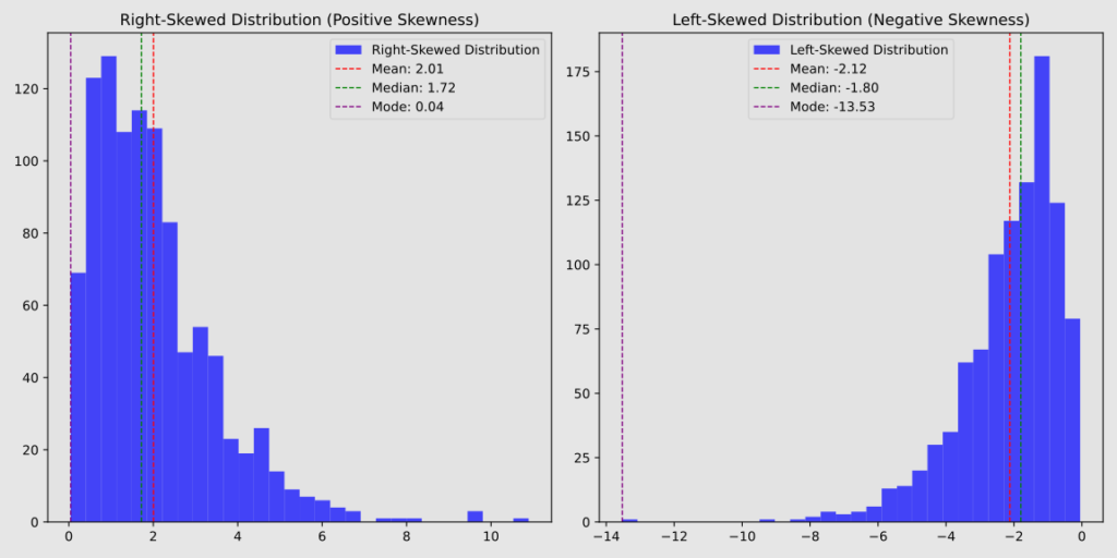
A distribution with a long tail to the right is called positively skewed, where the majority of values cluster on the left side while larger values spread out on the right.
Conversely, a distribution with a long tail to the left is called negatively skewed, where the majority of values cluster on the right side while smaller values spread out on the left.
A perfectly symmetrical distribution, such as a normal distribution, has zero skewness.
Of particular interest is the arrangement of measures of central tendency in cases of positive or negative skewness:
in positive skewness, most values cluster on the left side of the distribution. Here, the mode appears first, followed by the median, and then the mean, which is pulled towards the more extreme values on the right;
in negative skewness, most values cluster on the right side. The mode occurs at the highest point, with the median to its left, and the mean even further left.

Curtosis
Kurtosis is a statistical measure that describes the shape of a data distribution, specifically how “peaked” or “flat” it is compared to a normal distribution.
The main kurtosis categories are:
- Mesokurtic (kurtosis = 3): Matches a normal distribution.
- Leptokurtic (kurtosis > 3): More peaked than normal, with heavier tails.
- Platykurtic (kurtosis < 3): Flatter than normal, with lighter tails.
In a leptokurtic distribution, more values cluster near the mean, but there are also more extreme values in the tails. This results in greater overall variability, though it’s important to note that kurtosis itself isn’t a measure of variability.
For example, blood glucose values in diabetic patients often follow a leptokurtic distribution. While many readings are close to the mean, there are more frequent episodes of hyper- and hypoglycemia compared to a normal distribution.

Quartiles and percentiles
When we order our dataset from lowest to highest value and divide it into four equal parts, each containing 25% of the numbers, we obtain quartiles.
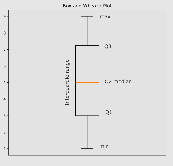
The first quartile contains the first portion of data and is called Q1. It delimits the first quarter of numbers. The second quartile Q2 ends at 50% of the data, corresponding to the median: in fact, it divides our data into two exactly equal parts. The third quartile Q3 encompasses the third quarter of data and the fourth quartile Q4 the last quarter.
The second and third quartiles encompass the middle 50% of the data—the central portion of the distribution. This range is called the interquartile range. It’s a particularly useful measure of dispersion because it’s not influenced by outliers:
IQR = Q3 – Q1
A box and whisker plot is a widely used graphical representation in descriptive statistics that primarily utilizes quartiles. This plot displays key information about a dataset, including the minimum and maximum values, interquartile range, median, and outliers.

Unlike quartiles, which divide data into four equal groups, percentiles split it into 100. This finer division allows for more detailed analysis of the distribution. To illustrate the relationship between quartiles and percentiles: the first quartile corresponds to the 25th percentile, the second to the 50th, and the third to the 75th percentile.
If you’re interested in the Python code used to generate the graphs on this page, click here.


